Have you ever wondered why Dior chose shades of raspberry and wine for their 2018 limited edition nail polish line? Or why Nate Berkus’ Target collection teems with sandy tones and warm neutrals? Well, you can look to The Color Association of The United States (CAUS) and its color council for your answer. CAUS formed after the Industrial Revolution to help industries like the textile trade predict which colors and styles would earn the biggest bucks. Today, the CAUS predicts those trends through the help of their trusty council, in which members like Emily Mann and her colleagues, referred to as “Color Czars,” research, convene, and debate which colors should, and will, dominate industries like interior design, fashion, automotive, cosmetics and more.
According to Mann, the council’s process of color forecasting is similar to a poker game; the players ante up, throw their personally picked color swatches on the table and discuss which are winning and losing hands. For Mann individually however, color forecasting is involuntary; when we go into a department store, we shop but when Mann goes into department store, she’s noticing the ratio of blues to maroons, of yellows to browns. Shen then creates a “color story,” which is basically a stack of colored fabric swatches, a laminated image or two on top, all wrapped with a pretty pink ribbon that Mann drapes around her neck as she tells her stories. The laminated images are photos from magazines or a Google search that Mann feels encapsulate the color palette she’s formed in her head. This year’s stories were introduced with titles like “Deep Envy” and “Peafowl & Devil’s Tooth.”
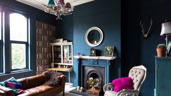
But, let’s get into the colors Mann thinks will dominate the upcoming years in the Interior Design world. This year, we’re going to see a lot of Grey; and when Mann says “a lot,” man oh man, she means it. The reason for the grey cloud is that the overarching trend will be to lay down a dark base and add pops of bright, contrasting color. Those dark colors could be cabernet-cast-maroons, deep peafowls, the opaquest browns, or dark mossy greens. This forecast pairs browns with milky pastels, frosty teals, or both cool and warm neutrals. A deep peafowl gets cheeky when accessorized with raspberry or, for some earthy sophistication, this quirky blue can be paired with artisanal colors like sand or camel.
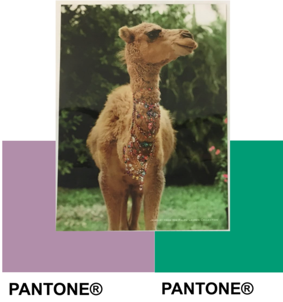
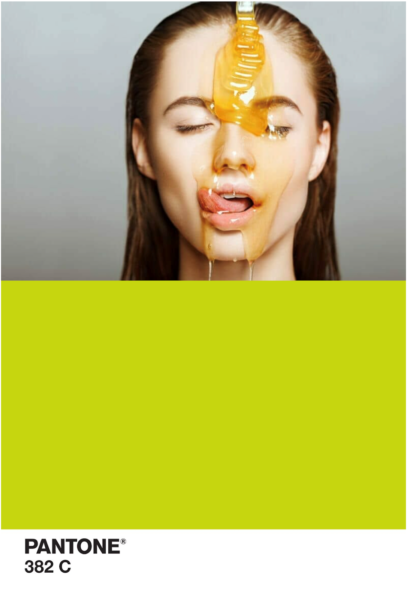
Artisanal colors are going to flood the next few years of interiors; to keep things fresh, liven them up with feminine light pinks and corals or precious gem tones like emerald and opalesque purples. My personal favorite upcomer is the yellow trend, which we’ll see either as an overlay, which casts the coolest honey wash gleam, or as an opaque, which emits a soothing green cast.
In any home though, these colors tell different stories because, like Mann says, the message is in the material, not just the color.