FRONT International: Cleveland Triennial for Contemporary Art opened last week in Northeast Ohio. The exhibition, which is modeled after documenta in Kassel, Germany, connects international artists and curators with major museums, institutions, alternative spaces, and civic spaces, throughout the Great Lakes region.

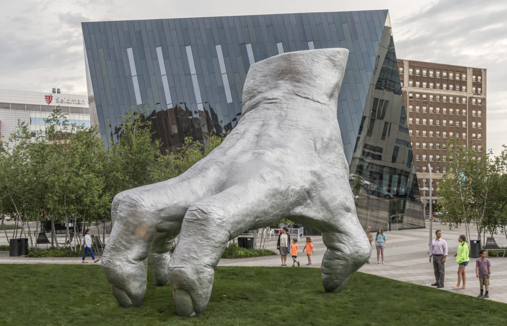
Tony Tasset, Judy’s Hand Pavilion, 2018. Installation view at Toby’s Plaza, Case Western Reserve University. Commissioned by FRONT International: Cleveland Triennial for Contemporary Art in collaboration with Toby Lewis and the John and Mildred Putnam Collection at Case Western Reserve University. July 14-September 30, 2018. Photography by Field Studio.
The inaugural triennial, under the leadership of director Fred Bidwell and Artistic Director Michelle Grabner, invited artists to examine the complex transformations that Cleveland, Ohio has undergone in recent decades. “Treating Cleveland as both a model of urban development and a physical site, the programs will elucidate the ways in which contemporary experiences of urban development are shaped by historical and current events, and how a city’s collective memory and sociopolitical imperatives can define its artistic and curatorial production,” states Grabner. On view through September 30th, a significant goal of the triennial is to change the center of gravity in the art world by shifting the focus away from the coasts and toward the heart of the country.

Yinka Shonibare MBE, The American Library, 2018. Installation view at The Cleveland Public Library. © Yinka Shonibare MBE. Commissioned by FRONT International: Cleveland Triennial for Contemporary Art. July 14-September 30, 2018. Courtesy James Cohan Gallery, New York and FRONT International: Cleveland Triennial for Contemporary Artwith funds from VIA Art Fund, Cleveland Public Library and The City of Cleveland’s Cable Television Minority Arts and Education Fund.
FRONT’s 100+ artists, hailing from Beijing to Chicago, include: Marlon de Azambuja, Dawoud Bey, Virginia Overton, Julie Ezelle Patton, Michael Rakowitz, Yinka Shonibare, Martine Syms, Tony Tasset, and Philip Vanderhyden.

Martine Syms. Installation view at the Museum of Contemporary Art Cleveland, FRONT International: Cleveland Triennial for Contemporary Art. July 14-September 30, 2018. Courtesy of the artist and Bridget Donahue, New York. Photography by Field Studio.
One of FRONT’s memorable installations is Canvas City, a revival of Cleveland’s 1973 City Canvases public art project. FRONT presented a historical exhibition of the project in the Old Arcade and a series of large scale murals located downtown, centering on the recreation of Julian Stanczak’s Winton Manor at its original home of Prospect Avenue and 9th street. Stanczak’s mural stands in context with contemporary mural designs by artists Sarah Morris, Odili Donald Odita, Kay Rosen, and Heimo Zobernig.

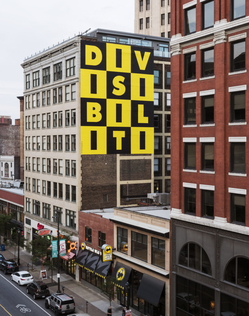
Kay Rosen, DIVISIBILITY, 2018. Installation view at 750 Prospect Avenue. Commissioned by FRONT International: Cleveland Triennial for Contemporary Art. © Kay Rosen DIVISIBILITY 2018. Photography by Field Studio.
Quiet Lunch met with Kay Rosen to discuss her mural DIVISIBILITY which faces just west of 9th street, in Canvas City. Rosen is known for creating graphically dramatic murals that treat letters as abstract shapes and as components of words with multiple meanings or potential interpretations. Her FRONT mural contains a grid of capital letters in black and yellow measuring three across and four from top to bottom that spell out “DIVISIBILITI.” Throughout the work, black and yellow color fields seem to blink with authority, cautioning against any integration. States Rosen, “I think the piece is representative of the times, of the stark divisions in our society, and it seemed appropriate. It’s not necessarily political, but it can be read as such. All of my works begin with language, with the structure, and then expand from there depending on the context and the viewer’s associations. They often function like micro universes representing larger worlds.”
Quiet Lunch: Your mural, “DIVISIBILITY” is a work from 1987, that you repurposed for the FRONT International: Cleveland Triennial for Contemporary Art in Downtown Cleveland?
Kay Rosen: Yes. Originally, it was made as a small painting in 1987. Over the years it has been reformatted for various public sites. It has been recreated horizontally with yellow and black alternating stripes (at Kunsthalle Bielefeld in Germany and again at the Contemporary Arts Museum Houston) and it was rendered in black and white on a field of columns in Chicago. But what you see here today is the original format; a bold checkerboard arrangement. As long as the divisions between the consonants and the letter I’s are evident, it works.
QL: In this format, the “I” turns into something else.
KR: Yes, every consonant alternates with an “I” which functions as a mark of division, like the / sign in math, or a door or wall, pictorially reinforcing the meaning of the word. It is uncanny the way six syllables embody the concept of DIVISIBILITY with their rhythmic repetition of I-like vertical barriers. I love it when meaning and structure intersect like that.
QL: What other work have you made that is similar to this one?

Kay Rosen, “Blurred,” 2004, acrylic paint on wall, Art Gallery of New South Wales, Sydney, Australia. © 2004 Kay Rosen
KR: Do you remember the wall painting Blurred?
QL: Of course.
KR: Like DIVISIBILITY, Blurred is a found, self-made work in which the internal linguistic structure coincidentally reflects the meaning: BLU-R-RED. BLU is painted blue, RED, red, and R, as the point in the center, the hinge, where two extremes blend, is painted purple. Many think that it refers to blue and red states, as it was made in 2004, a presidential election year, but I think that is too limited an interpretation. It is in the collection of a museum in Sydney which to me means that it resonates beyond national borders.
QL: All the innuendos and possibilities in language and word play! It could go on forever!
KR: It’s exciting to discover potential in language that exceeds its normal usage.
FRONT International: Cleveland Triennial for Contemporary Art is happening all across Cleveland and Northeast Ohio this summer from July 14 – September 30, 2018. For more information, please visit their website for information and programming.

Heather Zises is an independent curator and founder of READart, a curatorial platform for contemporary art and culture. Having launched her career at Pace Gallery and Phillips, she has curated numerous exhibitions and site-specific installations at galleries, alternative spaces and art fairs worldwide. Heather is a contributing writer for diverse publications including Whitehot Magazine and Fjords Review, and is an art editor for Pregame Magazine. This fall, Heather’s first book, 50 Contemporary Women Artists, will be released by Schiffer Publishing.

