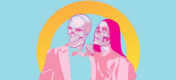
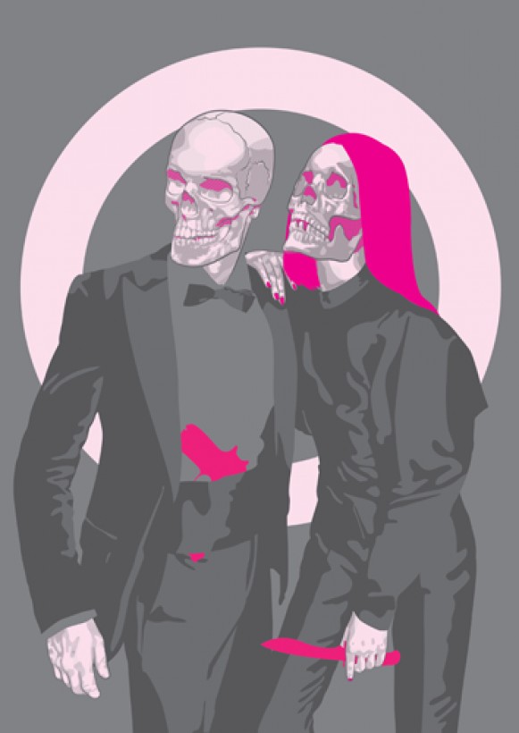
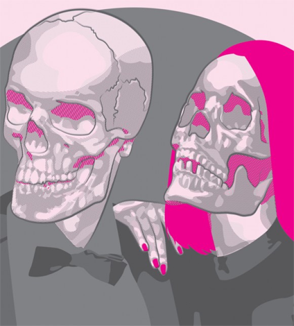
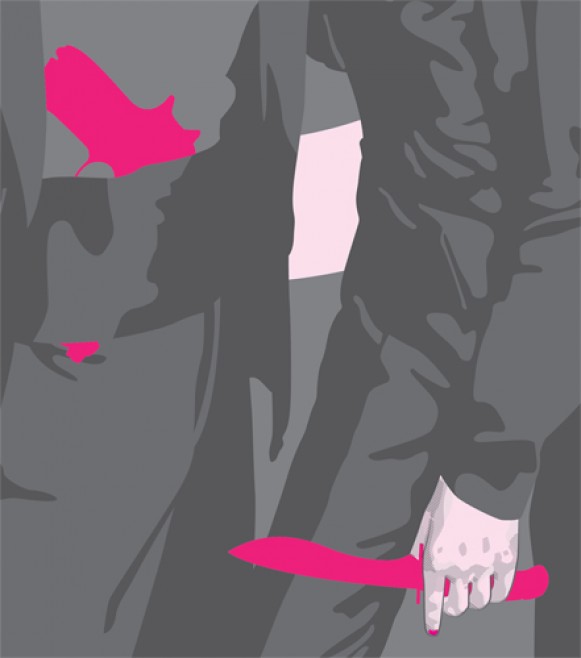
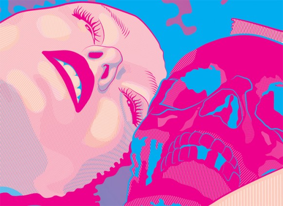
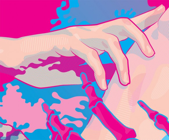
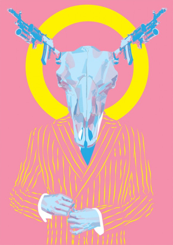
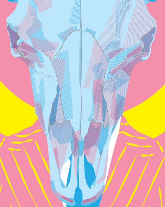
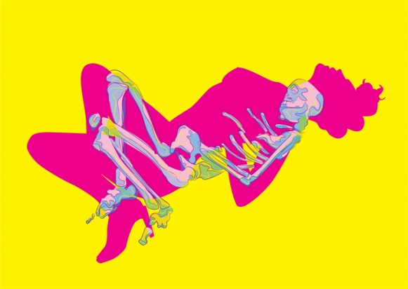
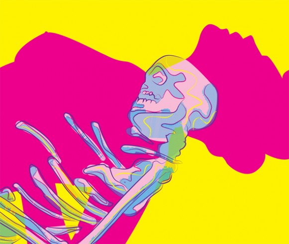
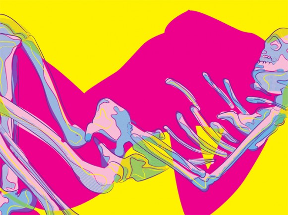
Joe Murtagh‘s work is as dangerous as it is vibrant. The Liverpool based illustrator brews a brilliant batch of chic death and retro decay. His work is unlike anything we’ve ever seen really.
Sure, there are a number of artists that do the whole “skull and bones thing” but Murtagh has that special touch. He knows what he’s doing and it only results in him doing it well. The way he delivers his work is done in the method of an absolute showman who has spent time honing his craft.
Albeit his extraordinary execution, one could quickly peg Murtagh as a one-trick pony. Most of his pieces — excluding his earlier pre-digital works — include skulls or skeletal forms. One can only wonder if Murtagh is just creatively cashing in on the badass nuances of skulls and skeletons. But Murtagh offers up an explanation that reveals his affinity to be more than cool for the sake of cool.
Describe your perceived fascination with skulls and skeletons?
“The older I get, the more aware I’ve become of how quickly it goes. And how we lose loved ones along the way. One book that I go back to from time to time is The Tibetan Book of Living and Dying. In it it describes how we can’t appreciate life without accepting death. That notion has fascinated me, and has become part of my philosophy. No light without shade etc etc.
The skulls and the skeletons are a short hand for me, a nod at mortality. Also a sly comment on how dead our society seems at times, dead to what really matters in life. They can also represent taboos, the dark side of our human nature, like guilt or regret. But also what drives us.”
The other dominant feature in Murtagh’s work is the color. His pieces are a continuous acid trip. You can say that Murtagh has a special relationship with color. His superb knack for marrying the proper hues is an attribute that carries his work with vigor.
Your color schemes are magnificent. Is there a certain process that you go through when it come to determining which colors you use in a piece?
I do love colour, and the effect it has on certain subject matter. I use strong colour to sugar coat certain themes. To give a false sense of cheerfulness. It also adds an element of humor. Looks misplaced and not quite right. I also like how colour can bounce off each other, and make something far more vibrant and vivid, even trippy.
While we marveled in his work, we found ourselves searching for label. Is it pop art? Is it macabre? We couldn’t exactly place a finger on Murtagh’s genre. Surprisingly, the former painter/sculptor turned digital dynamo also endures the same struggle.
On defining his genre:
“This really puzzles me, and I’m still not sure what genre my work falls into. I guess it’s Surreal, with maybe a Neon Gothic edge? I don’t know. Any help with this would be great!
The media seems so suffocating at present, information overload and all that. I’ve tried hard to create my own style, but did nothing for years, conscious of not mimicking other people. But after a while I found a way to have a voice, and had something to say. Again, I’m not sure what genre I find myself in. Answers on a postcard please? [Smiles]”
Although we dug the Neon Goth nod, the truth is, who gives a flying fajita what his genre is? With all due respect to the structure of art history and its jargon, his work simply just is — and if the notion of “just is” fails to suffice, try this hat on for size; Joe Murtagh’s genre is radiance. Sheer fucking radiance.

Akeem is our founder. A writer, poet, curator and profuse sweater, he is responsible for the curatorial direction and overall voice of Quiet Lunch. The Bronx native has read at venues such as the Nuyorican Poets Cafe, KGB Bar, Lovecraft and SHAG–with works published in Palabra Luminosas and LiVE MAG13. He has also curated solo and group exhibitions at numerous galleries in Chelsea, Harlem, Bushwick and Lower Manhattan.

