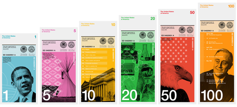
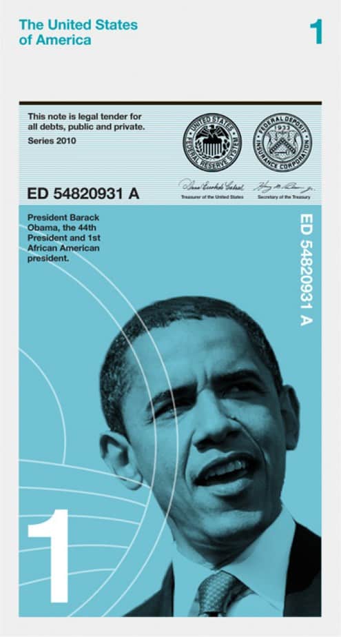
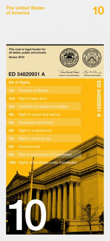
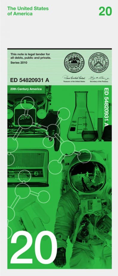
In an effort to ‘rebrand the US Dollar, rebuild financial confidence and revive our failing economy, New York designer Richard Smith has founded The Dollar ReDe$ign Project. We have seen most of the submissions to the project but the one that strikes us the most is the submission from Dowling Duncan.
Simultaneously progressive and traditional, the redesign currency tells the history the United States while looking brilliantly forward. The current currency being used by Americans seems outdated and out of touch compared to these modern redesigns by Dowling Duncan.
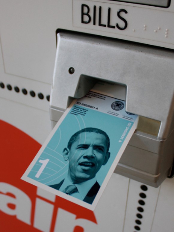
• $1 – The first African American president
• $5 – The five biggest native American tribes
• $10 – The bill of rights, the first 10 amendments to the US Constitution
• $20 – 20th Century America
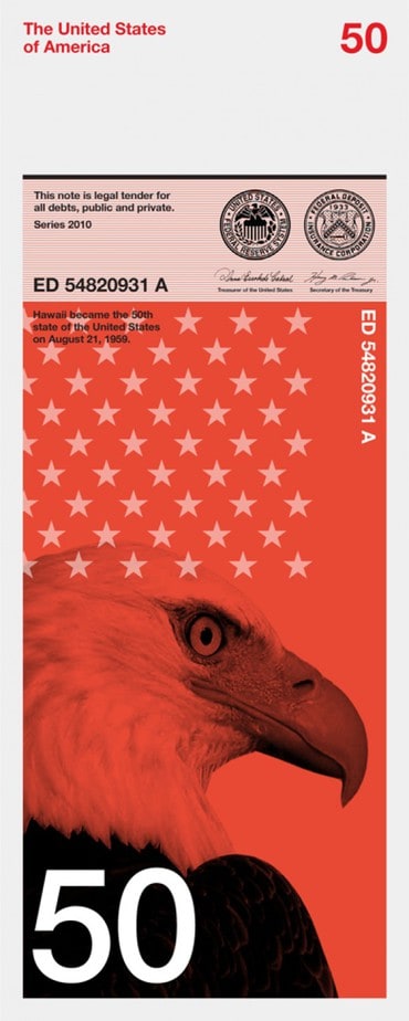
• $50 – The 50 States of America
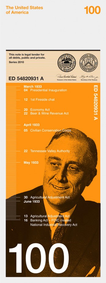
•$100 – The first 100 days of President Franklin Roosevelt. During this time he led the congress to pass more important legislations than most presidents pass in their entire term. This helped fight the economic crises at the time of the great depression. Ever since, every new president has been judged on how well they have done during the first 100 days of their term.
Why the size?
“We have kept the width the same as the existing dollars. However we have changed the size of the note so that the one dollar is shorter and the 100 dollar is the longest. When stacked on top of each other it is easy to see how much money you have. It also makes it easier for the visually impaired to distinguish between notes.”
Why a vertical format?
“When we researched how notes are used we realized people tend to handle and deal with money vertically rather than horizontally. You tend to hold a wallet or purse vertically when searching for notes. The majority of people hand over notes vertically when making purchases. All machines accept notes vertically. Therefore a vertical note makes more sense.”
Why different colors?
“It’s one of the strongest ways graphically to distinguish one note from another.”
Why these designs?
“We wanted a concept behind the imagery so that the image directly relates to the value of each note. We also wanted the notes to be educational, not only for those living in America but visitors as well. Each note uses a black and white image depicting a particular aspect of American history and culture. They are then overprinted with informational graphics or a pattern relating to that particular image.”

Quiet Lunch is a grassroot online publication that seeks to promote various aspects of life and culture with a loving, but brute, educational tinge. When we say, “Creative Sustenance Daily,” we mean it.

